|
|
Post by Jonathan Christophé on Jan 3, 2005 14:24:52 GMT -5
|
|
|
|
Post by timjr on Jan 3, 2005 15:31:47 GMT -5
I like the broken sword idea. I don't know if colors other than the green, brown, orange, red, and white (all previously used) should be used unless we are committed to changing our national colors entirely.
As for the elements I prefer the Southern Cross designs.
|
|
|
|
Post by Bartholomew Henzelli on Jan 3, 2005 21:59:25 GMT -5
I, too, like the southern cross iconography. But the broken sword doesn't immediately appear to be broken. Perhaps if you had it broken more towards the middle with a gap between the two parts?
|
|
|
|
Post by timjr on Jan 3, 2005 22:23:48 GMT -5
I like the sword as Jon made it. In that case, the sword is still useable to hurt somebody, but to easily kill (or destroy someone). Lavalon is all about peace, and the occasional need for security, but not about destruction or disruption.
Making the sword broken in the middle as you suggest, Henzelli, would make Lavalon look too weak. For a while the presidential seal of the US had the gryphon with the banner across its neck until someone noticed that it was "strangling" the bird, and so they made the banner go behind its neck.
|
|
|
|
Post by Bartholomew Henzelli on Jan 8, 2005 10:18:16 GMT -5
Lavalon is about peace, not destruction. Unless we had a sudden reversal in regards to our former rec-war policy that I didn't hear about.
And a broken sword wouldn't make us look weak. It would show that we are willing to make peace. And is that not the point of Lavalon? A peaceful populous of peaceful people? Unless one is battling with personal insecurities, there should be no need to have a broken sword where the break is vague and almost non-existent.
|
|
|
|
Post by timjr on Jan 8, 2005 12:35:40 GMT -5
A sword broken down the middle would be the laughing stock of our allies and humiliating for me as a Lavalonian citizen.
A sword broken at the top (as Jon did) is the best solution because the force of the sword is still strong, but its deadliness is hampered.
|
|
|
|
Post by Jonathan Christophé on Jan 8, 2005 13:52:06 GMT -5
 This is the curtana, the pointless sword of mercy, used in the coronation cermony of the English monarch. This is the post English Revolution model, the old sword was the actual Curtana, which is in a few legends. Curtana comes from the Latin "Curt us", which means shortened. Therefore, as a design, Henzelli is right in some point, it should be shortened, but not broken in two. I just found out now that the point of the design is for the sword not to have a point, therefore I'm sure I can redesign it to keep all of the above in mind. |
|
|
|
Post by Bartholomew Henzelli on Jan 8, 2005 17:48:07 GMT -5
I'm not sure how it would be humiliating for you Xon. And how would it make us the laughing stock of our allies? Why don't we just scrap the sword and come up with something else?
Why, exactly, do we need to "hurt somebody", as you so eloquently put it? Again, this is a nation of peace. We do not rec-war, so we have no reason for a military department, much less a defense department. So why do we need an instrument of pain and hurt?
|
|
|
|
Post by timjr on Jan 8, 2005 17:56:19 GMT -5
We're not hurting anybody, Henzelli.
Seriously, does a sword broken down the middle signify strength or weakness. At least Lavalon should appear strong.
|
|
|
|
Post by Bartholomew Henzelli on Jan 8, 2005 18:01:23 GMT -5
It symbolizes peace. "The breaking of weapons to make peace" and all that.
We can make Lavalon look strong without such a war-like weapon. We've already had trouble with Lavalon looking like a joke after your ill-fated use of the word "coup," let's not make it any worse with our policy against rec-war in conjunction with a flag that clearly has a sword emblazoned as the focal point.
Put a picture of a bear, a bridge, a bundle of sticks, a brick, a rock, a hand clenched in a fist thrown up in the air, or anything that isn't so blatantly war-like that still represents strength.
|
|
|
|
Post by neem on Jan 8, 2005 18:46:28 GMT -5
Interesting... Jon's idea sounds good to me
|
|
|
|
Post by Jonathan Christophé on Jan 9, 2005 13:56:10 GMT -5
We obviously need a new National Symbol to represent us. Since we're trying to back away from Kirian's old designs, I've been trying to come up with as many things as possible... And although my idea for the new seal is pretty good, we need something a bit simpler for a flag. The first design I submited for the flag was pretty good, but looked too fabricated. The second one is nice, but we're having an issue with the sword. Third times the charm, right? Something more simple. EDIT: I've also found a realy interesting site. The North American Vexillological Association: www.nava.org(Vexillology is the study of flags) |
|
|
|
Post by Bartholomew Henzelli on Jan 9, 2005 19:29:49 GMT -5
Neat! NAVA is interesting......I will have to bookmark the site.
|
|
|
|
Post by admin on Jan 9, 2005 21:39:11 GMT -5
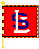
Vexillology is very interesting! got my dad a vexillological book once, i think i read it more than he did!  and St Louis is the fifth best city flag in American, awesome!! i always loved the St Louis flag too!!! and Natopia's flag stand up to the 5 basic principles of a good flag... except our colors dont contrast... i might play around with different colors... but... probably wont do anything avbout it...lol |
|
|
|
Post by Bartholomew Henzelli on Jan 9, 2005 22:00:42 GMT -5
The SSNG's flag stood up to the test, too. And the new seal, should we adopt it, also stands up to if if we put it on the flag. Neat!  We bad....we bad....lol |
|


 We bad....we bad....lol